Figma
Prototyping
User flows
Testing
Wireframing
High fidelity mockups
Personas
Journey mapping
Information Architecture
User research
In June 2024, through copywriting and designing wireframes in Figma, I transformed ProPhase's website, turning it from a generic template website with an overload of information, into a website that truly reflects their expertise in energy solutions and significantly boosts user engagement and understanding of their products, services, and information guides.
Problem
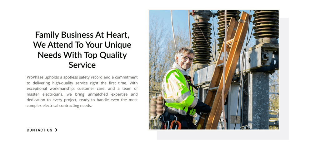
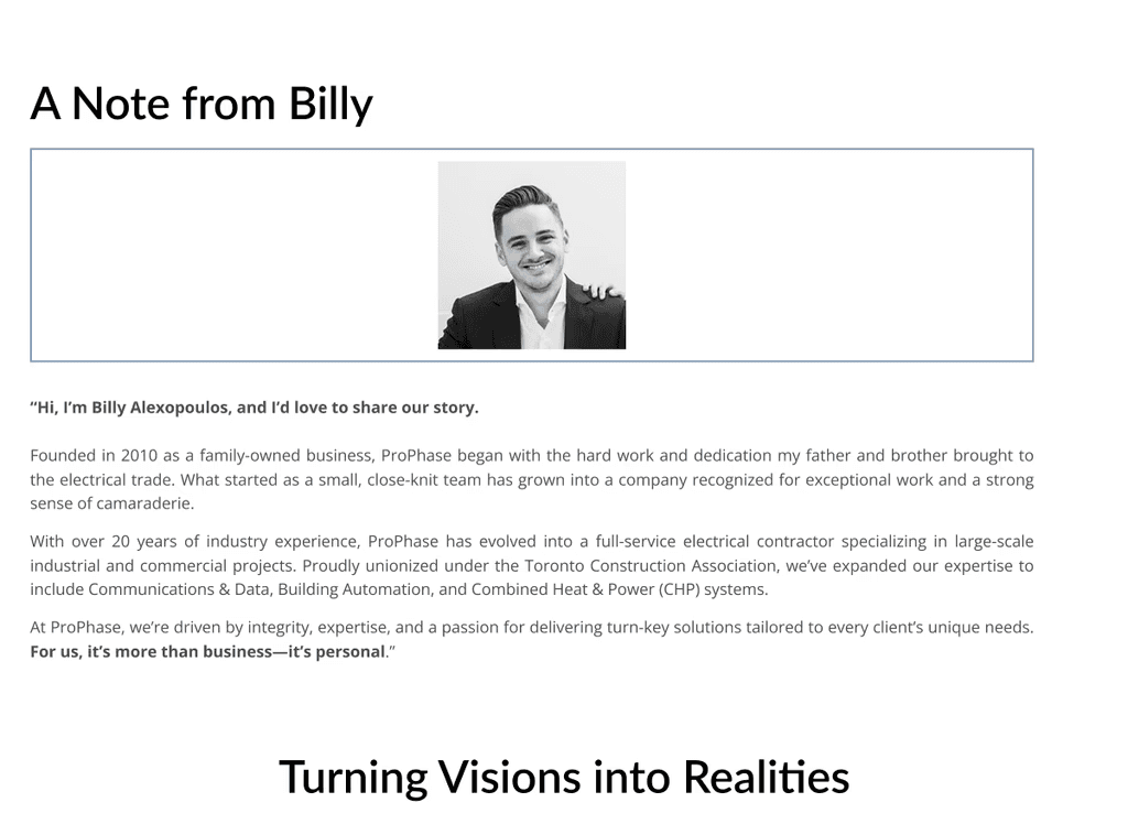
The original website didn't capture what makes ProPhase unique. The layout of the website was generic, with lengthy paragraphs in every corner, and not any indications of a personalized look or mention of their family-owned-and-operated roots.
Designing pages that convert visitors into clients
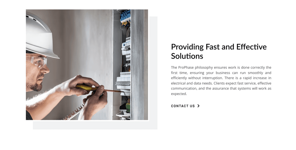
I took apart the generic template and rebuilt the site from the ground up, customizing every aspect to align with their brand and vision for a user-centric experience.
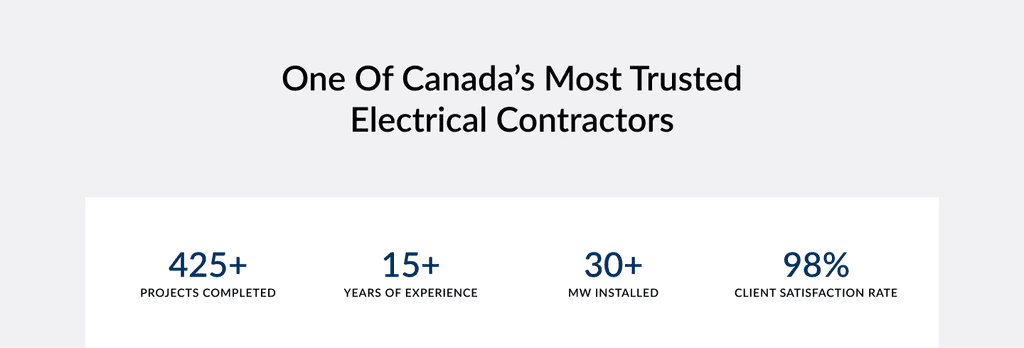
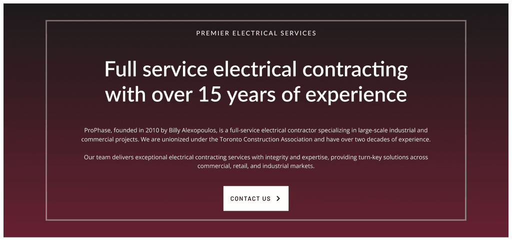
I designed an engaging homepage that immediately communicates ProPhase's strengths. Using compelling visuals and clear calls to action, the homepage guides visitors to the most important information without overwhelming them.
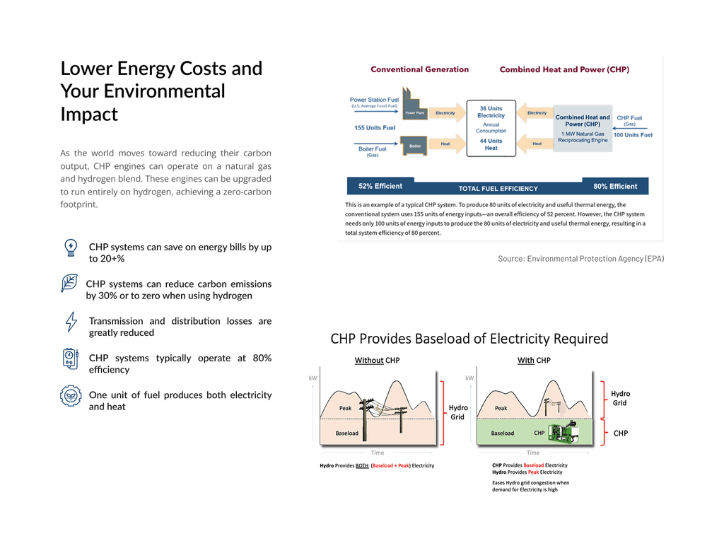
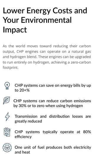
For the CHP Systems page, I translated technical jargon into accessible language. By incorporating infographics and interactive elements, I made it easy for visitors to understand the benefits without needing an engineering degree. The new design breaks apart the information into a digestible format through bullet points, highlighted and prominent headers and statements, and a much more streamlined approach to the amount of text.
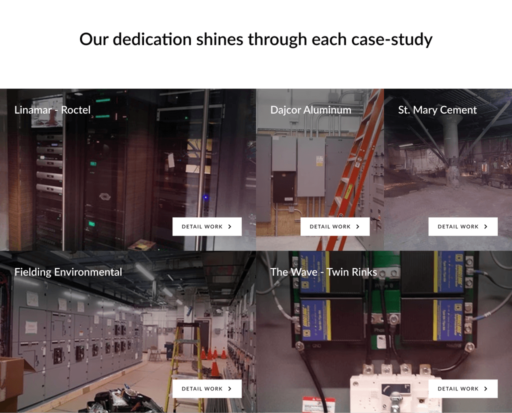
I created a dedicated case studies section, featuring detailed profiles like the Target project. By highlighting real-world challenges and solutions, I demonstrated ProPhase's expertise and reliability to potential clients. Through these case studies, users will be able to understand the process of a ProPhase project from start to finish, answering questions that they may not know they would have due to the process, conflict, and resolution all being laid out in front of them in a transparent manner on each case study
On the Toronto Service Area page, I tailored content to resonate with local businesses. Including regional testimonials and addressing area-specific needs made the content more relevant and engaging for that audience.
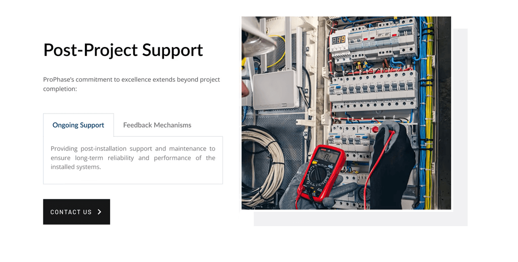
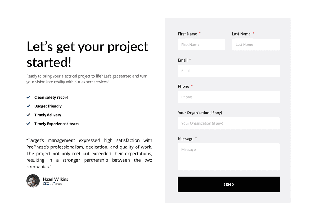
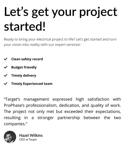
I redesigned the Contact Us page to make it effortless for visitors to get in touch. By simplifying the form and making contact information readily available, we removed barriers that might prevent potential clients from reaching out.
Working with engineering and overcoming technical challenges
Customizing beyond template limitations
The generic template couldn't support the functionalities we needed. I went under the hood to deconstruct their website into a new and customized site, with a new colour pallet, and an agreed upon reference template that would inspire the new designs. Integrating these extensive changes, I was able to work closely with their team in extending the site's capabilities without compromising performance.
ProPhase initially came to us with no real idea of the colour pallet to use for their website and branding, so through back and forth conversations to uncover what they were looking for in their aesthetics and visual layout, I chose the theme of minimalism, with black, white, and blue being their new colour pallet.
Translating technical expertise into engaging content
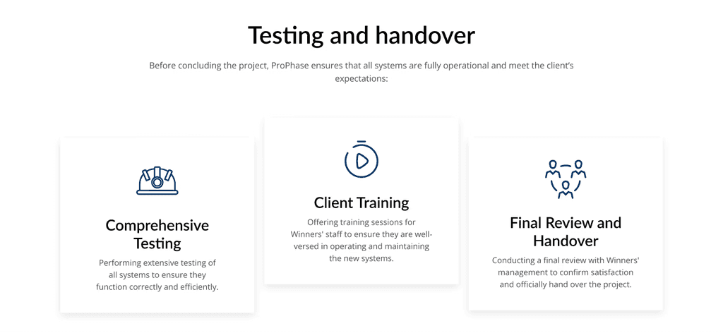
Working alongside ProPhase's engineers, I distilled complex energy solutions into content that resonates with potential clients. Visual aids like infographics and animated information videos simplified complicated concepts, making them accessible to a broader audience.
Ensuring a great experience across all devices
Though we began with their desktop design, I still had mobile users in mind. I rigorously tested the site on various devices and screen sizes, optimizing for responsiveness to ensure that users have a consistent, high-quality experience whether they're on a desktop, tablet, or smartphone.
Collaborating closely with ProPhase stakeholders to align goals
Ensuring the website reflects their brand and messaging - Regular meetings with ProPhase's team were essential. By staying in close communication, I ensured that every aspect of the website stayed true to their branding, their story, and effectively conveyed their messaging, resulting in a cohesive and authentic online presence.
Measurable results
Based on my conversations and research, the solution and design needed to account for the following challenges:
45% increase in user engagement: The revamped site led to longer visit durations, indicating that users found the content valuable and engaging.
50% more inquiries: Improved design and clearer calls to action resulted in a significant uptick in contact form submissions and inquiries.
Enhanced brand perception: Feedback highlighted the professional appearance and ease of navigation, boosting ProPhase's credibility in the industry.
Reflection: delivering a design that powers business growth
I grew professionally through this project, in three key areas:
Mastering advanced web customization: I pushed beyond standard templates to create a tailored solution that met specific business needs, enhancing my skills in web development and design.
Getting better at communication: Collaborating with ProPhase engineers and executives, I improved my ability to translate technical information into user-friendly content, a skill that's invaluable in any industry.
Deepening my user-centered design approach: Focusing on the end-user's experience reinforced the importance of intuitive design and accessibility, principles I carry into every project.
By transforming ProPhase's website, I didn't just create a better-looking site, but rather I developed a powerful tool that engages users, communicates value effectively, and drives tangible business results. I learned through this project the importance of a brand's individuality and their online persona. This project was a rewarding challenge that allowed me to contribute significantly to ProPhase's success while growing as a designer.
This project helped to build on my ability to structure and present large amounts of content in a way that feels natural and easy to scan, reinforcing the notion that clarity is just as impactful as design aesthetics. Working closely with stakeholders highlighted the importance of consistent communication, aligning on shared goals, and staying adaptable when new challenges or opportunities arose to showcase the brand in a more unique way. These lessons reinforced the value of crafting a user experience that serves both the brand and its audience.


