Figma
Competitor analysis
Branding
Lovable
Figma Make
V0 Vercel
Prototyping
User flows
Testing
Wireframing
High fidelity mockups
Personas
Journey mapping
Information Architecture
User research
In August 2025, I rebuilt MBNYC’s science-backed brand from the inside out: a full rebrand and conversion-first website for a virtual training company focused on pain-aware strength, cardio, and mobility. I led: brand strategy, visual identity (typography, colour, layout system), research, competitive teardown, reference curation, copywriting, illustration, and image direction. I applied CRO-driven design principles to translate their real-world reputation for expert-led virtual classes into a digital presence that feels credible, motivating, and alive.
Using tools like Figma, Lovable, V0, Nano banana, and Figma Make, I condensed what would normally be dozens of iteration cycles into an optimized, fast-moving design system then reinvested that time into what moves metrics: message clarity, schedule design, trial flows, and proof.
The mandate wasn’t “make it pretty”, it was: make the brand unmistakable, make the value obvious, and make the actions (book a class, start trial, watch a recording) frictionless for a very specific audience: busy, high-income professionals (primarily women 45–65) who want functional independence, form-safe progress, and a community that remembers their name.
64%
Increase in conversions
20%
Increase in engagement time
35%
Increase in primary CTA clicks
64%
Increase in conversions
20%
Increase in engagement time
35%
Increase in primary CTA clicks
64%
Increase in conversions
20%
Increase in engagement time
35%
Increase in primary CTA clicks
Before (scrollable view)

Driving a 60% Increase in Online Orders for Sumachay Lifts Through Data-Driven UX Optimization
After (scrollable view)

Before (scrollable view)

Driving a 60% Increase in Online Orders for Sumachay Lifts Through Data-Driven UX Optimization
After (scrollable view)

Before (scrollable view)

Driving a 60% Increase in Online Orders for Sumachay Lifts Through Data-Driven UX Optimization
After (scrollable view)

Love being a know-it-all?
Let me walk you through my process
Love being a know-it-all?
Let me walk you through my process
Love being a know-it-all?
Let me walk you through my process
Problem
When MBNYC came to us, it was clear that while their live classes were beloved; the digital identity didn’t show it. There was no strong brand voice, no clarity on who this is for, and no conversion scaffolding to help a first-time visitor go from “curious” to “booked.”
After talking to stakeholders, I was able to narrow down the disconnect to 4 main pain points:
My challenge was to create a full-scale brand and website system that speaks to the right people, and make MBNYC look as reputable online as they are in class, using CRO patterns personalized to their method and vibe.
Research
Before I designed a single frame, I made it a point to immerse myself into MBNYC’s audience, ethos, and market position.
What I did:
Audience research
I studied the behaviours of MBNYC’s core demographic — busy women with demanding careers who value efficiency, health, and expert guidance. These users are often first-time fitness adopters, motivated by longevity and functional independence rather than aesthetics alone.
Competitive analysis
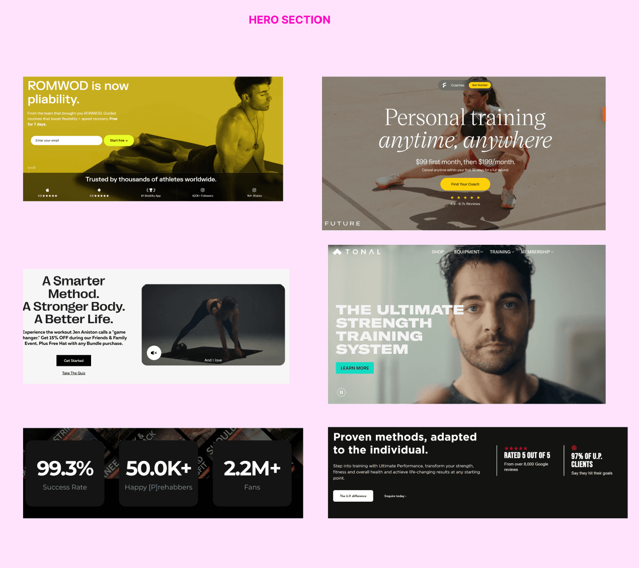
I dissected over a dozen competitors, including Peloton, Echelon, Fittr, The Class, Prehab Guys, Tonal, and Future. From these, I analyzed structure, storytelling tone, CTA design, trust signals, and layout rhythm — identifying which design elements triggered conversion and where MBNYC could differentiate.
Reference collection
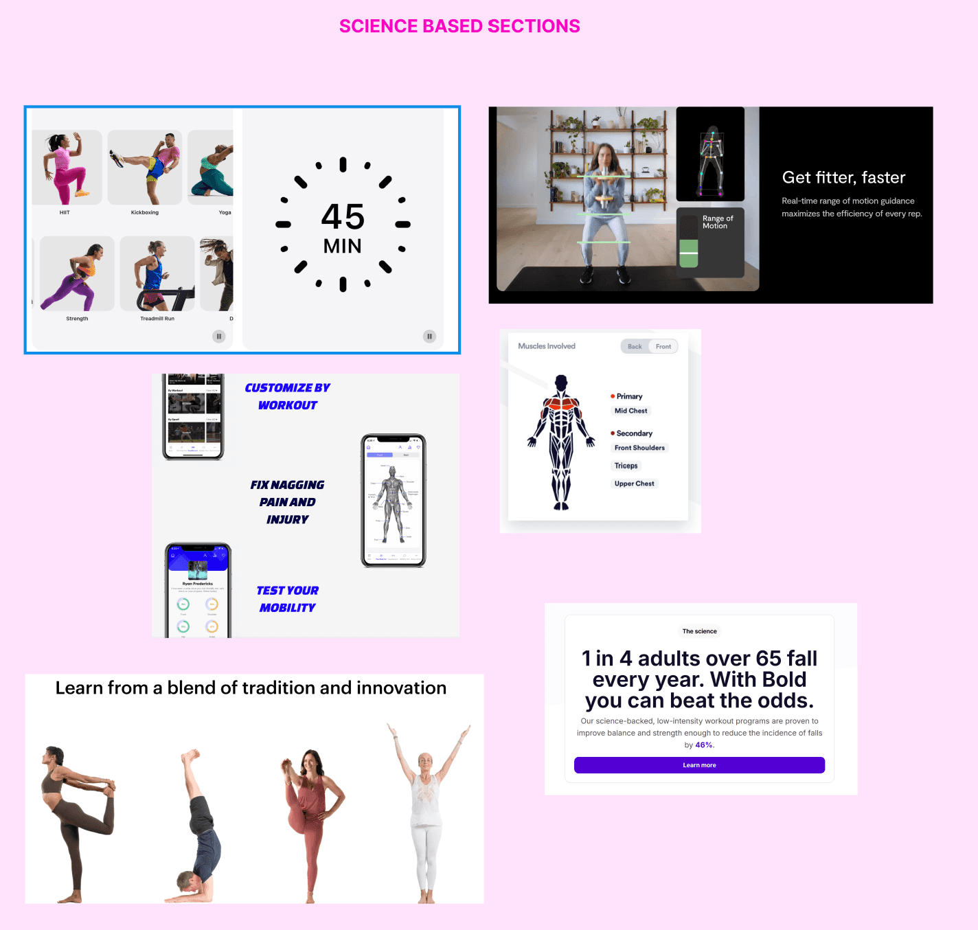
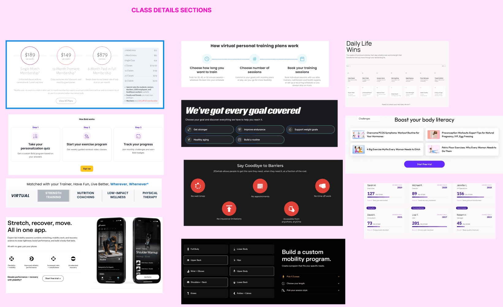
I pulled reference screenshots and section breakdowns (hero patterns, schedule layouts, progress visualization, testimonials, etc.) and annotated what worked for UX clarity and emotional engagement. These references later guided wireframe pacing and CRO strategy.
This research ensured every design and copy decision was anchored in what made MBNYC truly irreplaceable.
Competitive Analysis
I started with founder/stakeholder interviews to translate mbnyc’s lived philosophy language that resonates deeply with their target audience. I documented the training strategy: intrinsic-first strength, position-before-power, joyful accountability, injury parity (no one is “othered”), and the recording concierge that routes missed-live users to the right level. I mapped the audience: busy women 45–65; with their dream outcomes: pain reduction, stamina, independence; and listed out constraints: time, travel, intimidation, equipment ambiguity, and the feeling of “ is this going to make a difference?”.
Getting to work, I ran a competitive teardown across all virtual and live workout classes that preach similar promises. I screenshotted and annotated hero structures, schedule interfaces, proof stacks, trials, and pricing. I captured what genuinely converts vs. what just looks nice (over-styled heroes with vague copy). I then wrote MBNYC’s value props before touching design: who it serves; what’s different; why it matters. I codified outcome language around daily-life wins (standing upright, stairs, carry, balance) rather than vanity metrics.
Thought process: I treat research as design debt you either pay up front or pay with churn later. By spending the first few hours locking message pillars and audience fears/needs early, I could choose patterns with intent: we didn’t “add a schedule,” we sold certainty; we didn’t “show testimonials,” we narrated pain-to-performance arcs tied to actual classes.
Strategy
The strategy was to combine scientific credibility + emotional connection + conversion simplicity.
We needed to show the WHY factor with every area of the design, making you feel connected and trust the intrinsic first design of the workouts as opposed to hardcore and exhaustive workouts users are used to seeing advertised.
CRO-first hierarchy
Starting with CRO-tested frameworks for hero sections, credibility badges, and social proof, I was able to set up proof early on, but rewrote and restructured them around emotion and trust.
Instead of selling workouts, we sold results that feel real. That became the defining characteristic of the whole layout, proving to the audience that the goal isn’t unrealistic promises, but rather the promise that their daily life will become easier for them: walking without use of aids, being able to sleep on their ‘bad shoulder’ again, getting up from a chair with ease, etc.
Humanized UX flow
The site flow mimics the emotional rhythm of a live class — opening with motivation, followed by education (why it works), social proof, and then conversion points (bookings, trials, community entry).
Balancing performance and personality
While CRO principles informed structure, the brand voice was crafted to feel comforting, encouraging, and personal, aligning perfectly with MBNYC’s coaching philosophy.
We didn’t want them to just be educated on the changes they’ll experience with the classes and why they work, but also whats going to KEEP them there, and make them WANT to come back time and time again. MBNYC needed to be sold as a part of their weekly routine, not a one and done class.

Branding & Visual Direction
The brand needed to feel like a trainer you trust and a room you want to be in. I built a visual language that balances science-led training with the warmth of the classes: clean lines, generous breathing room, and confident typography that lands like a clear cue from a coach. The page rhythm moves from steady to spirited like a good class, so visitors feel held as they scroll, then energized at decision points.
The type I worked with carries most of the personality. Headlines have a composed, editorial elegance that says “we know what we’re doing,” while body stays airy and modern so longer reads don’t feel like a chore. Numbers and stats are crisp and feel like a cool digital clock. The overall typographic system doesn’t just label content; it stages it; headlines create anticipation, subheads create orientation, and scannable lines make action feel immediate.
Colour works like lighting in a studio. The base is comfortable with vivid accent steps only when it should: to signal action, to underline proof, to mark a win. instead of painting everything bold, I let colour flare at the right moments: buttons, focus rings, micro-badges. The result is a site that feels premium without pretense: inviting, not intimidating.
From the competitive analysis, I borrowed what worked and rejected what didn’t. Peloton’s momentum taught me to energize decision points; boutique brands taught me restraint and materiality. Many competitors lean into glossy hype or clinical graphs; I chose believable elegance: clear copy, human images, and micro-data placed exactly where nerves spike. The net effect is a brand that feels distinctive and inevitable at once; familiar enough to trust, specific enough to remember, and designed to move busy people from curiosity to commitment.

Tools, Automation, & Workflow Innovation
I used Lovable to create multiple wireframe variants quickly (hero, schedule, pricing), v0 to iterate layout patterns responsively and to explore the what-if layouts. Nano Banana became a fun tool to explore photo enhancement for consistency through the page; (lighting, tone, background distractions), and Figma Make to apply batch updates after feedback.
I didn’t want to just “use cool tools” - though secretly I did - I wanted to buy back my time. Automation trimmed low-value, repetitive work so I could spend energy on phrasing CTAs, sequencing reassurance, and clarifying pain points.

CRO Execution and Feedback
I rewrote MBNYC’s voice to feel like the coach you wish you had; calm, capable, and on your side. I needed to showcase through the copy exactly how MBNYC upholds its value props, and what makes them the workout class that will help heal your joints. I wrote the full site in a voice that’s authoritative, kind, and plain-spoken. Heroes lead with benefits that map to audience values (move without pain, feel independent, travel without losing momentum). I kept it minimal with short lines, natural cadence, and headings that read like cues. This minimalism kept the scroll feeling light. Specs and details live where decisions happen - next to buttons and schedules - so confidence builds exactly where the click needs it.
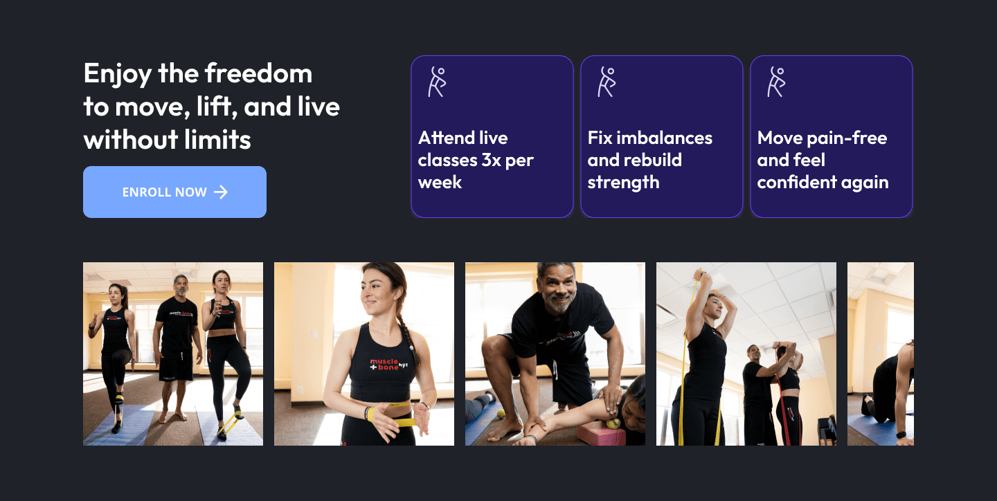
Microcopy was used to ease concerns ; Travel friendly routines, personalized adjustments tailored in a way it benefits the whole class, natural accountability through relationships formed in class, ect. I made the copy written as evidence you can feel without losing momentum on the page. CTAs are placed by mood, not guesswork. The hero invites a soft start. The workout close-ups invites a specific community feeling. FAQs answer the real fears: pain, timing, equipment, and starting from zero. Next to testimonials, the button borrows credibility.
My rule was simple: copy is the fastest way to reduce cognitive load. Every line had to carry evidence or ease. If it didn’t reduce cognitive load, disarm an objection, or make the yes feel inevitable, it was cut. Luxury comes from restraint; conversion comes from clarity. The copy does both at once; fewer choices, cleaner sections, and a rhythm that moves people from “maybe” to “booked” without ever feeling pushed.

Design Refinement & Feedback Process
After round one, the verdict was to turn up the science. I dialed up the “why it works” sections: clearer anatomy overlays, evidence-based sections where I discuss body form and the importance of leveling up in classes, and the difference between each type of class offered. I used this as an opportunity to help people understand WHY this works, as well as adding in personal touches like a story of how the founder came to building this brand after his own injuries. The whole wow factor of MBNYC was how tight-knit the community becomes and draws people into joining class after class, taking time from their busy schedules to participate together. These classes work for thousands and I needed to get better at proving WHY.
To further that proof, I went the route that is often overlooked - the pretty factor. This meant changing the colours to change the overall feel of the page. The bold accent stopped living in the background and started speaking only when there was something to do or something to trust. Action and focus, not paint. Through that change alone, the rest of the page calmed down so the buttons, chips, and focus rings actually carry meaning. It makes the site feel more expensive and more honest at the same time.
Thought process: feedback rounds were about subtracting anything that didn’t create clarity, safety, or momentum. Where there was a tie, I chose the variant that made a first-timer feel brave enough to click.

What Was Hard
Virtual classes are a sea of sameness: smiling stock photos, vague promises, endless options, and the same exact copy. Add to that the “I can just do a class at my gym” mindset, and you’re fighting two kinds of skepticism at once: why this brand, and why online at all. I had to make MBNYC feel specific, credible, and relatable in the first scroll.
The separation between the sea of sameness lived in the details most sites skip. I prioritized my time to strip out anything that smelled generic. Instead of “workouts,” we showed coaching. Instead of “features,” we showed outcomes in daily life. The schedule wasn’t a grid of times; it was a decision-light tool with human tags (knee-kind, shoulder-smart), real coach presence, and a clear first step for beginners. I had to show the very specific target audience just how much they could benefit from science-led coaching with just a few lines of copy at a time.
Reflection
This project reinforced one of my strongest beliefs: CRO design, and design as a whole is not one-size-fits-all.
Every company has its own psychology, rhythm, and story. CRO isn’t a template, it’s a language you translate into that story. MBNYC isn’t “just workouts.” it’s rehab-smart classes, relationship-built accountability, and identity (“I'm capable and independent”).
This project reminded me that the beauty of design and business stats rise together: the calmer and more premium the interface, the louder the proof reads. Automation (Lovable, v0, Nanobanana, Figma Make) was leveraged to focus on the parts only a human can do: understanding fear, and arranging information in a way that makes someone feel seen.
Each creative choice, from typography to tone, became part of a measurable strategy that served real users and real business goals. With this project, I deepened my appreciation for process automation and AI-assisted workflows, proving that freeing up production time lets me invest more energy in creative strategy, content precision, and storytelling clarity.
Ultimately, this project helped me evolve as a designer who can move fluidly between art direction and analytics, ensuring that every page I create looks beautiful and performs beautifully.
Problem
When MBNYC came to us, it was clear that while their live classes were beloved; the digital identity didn’t show it. There was no strong brand voice, no clarity on who this is for, and no conversion scaffolding to help a first-time visitor go from “curious” to “booked.”
After talking to stakeholders, I was able to narrow down the disconnect to 4 main pain points:
My challenge was to create a full-scale brand and website system that speaks to the right people, and make MBNYC look as reputable online as they are in class, using CRO patterns personalized to their method and vibe.
Research
Before I designed a single frame, I made it a point to immerse myself into MBNYC’s audience, ethos, and market position.
What I did:
Audience research
I studied the behaviours of MBNYC’s core demographic — busy women with demanding careers who value efficiency, health, and expert guidance. These users are often first-time fitness adopters, motivated by longevity and functional independence rather than aesthetics alone.
Competitive analysis
I dissected over a dozen competitors, including Peloton, Echelon, Fittr, The Class, Prehab Guys, Tonal, and Future. From these, I analyzed structure, storytelling tone, CTA design, trust signals, and layout rhythm — identifying which design elements triggered conversion and where MBNYC could differentiate.
Reference collection
I pulled reference screenshots and section breakdowns (hero patterns, schedule layouts, progress visualization, testimonials, etc.) and annotated what worked for UX clarity and emotional engagement. These references later guided wireframe pacing and CRO strategy.
This research ensured every design and copy decision was anchored in what made MBNYC truly irreplaceable.
Competitive Analysis
I started with founder/stakeholder interviews to translate mbnyc’s lived philosophy language that resonates deeply with their target audience. I documented the training strategy: intrinsic-first strength, position-before-power, joyful accountability, injury parity (no one is “othered”), and the recording concierge that routes missed-live users to the right level. I mapped the audience: busy women 45–65; with their dream outcomes: pain reduction, stamina, independence; and listed out constraints: time, travel, intimidation, equipment ambiguity, and the feeling of “ is this going to make a difference?”.
Getting to work, I ran a competitive teardown across all virtual and live workout classes that preach similar promises. I screenshotted and annotated hero structures, schedule interfaces, proof stacks, trials, and pricing. I captured what genuinely converts vs. what just looks nice (over-styled heroes with vague copy). I then wrote MBNYC’s value props before touching design: who it serves; what’s different; why it matters. I codified outcome language around daily-life wins (standing upright, stairs, carry, balance) rather than vanity metrics.
Thought process: I treat research as design debt you either pay up front or pay with churn later. By spending the first few hours locking message pillars and audience fears/needs early, I could choose patterns with intent: we didn’t “add a schedule,” we sold certainty; we didn’t “show testimonials,” we narrated pain-to-performance arcs tied to actual classes.
Strategy
The strategy was to combine scientific credibility + emotional connection + conversion simplicity.
We needed to show the WHY factor with every area of the design, making you feel connected and trust the intrinsic first design of the workouts as opposed to hardcore and exhaustive workouts users are used to seeing advertised.
CRO-first hierarchy
Starting with CRO-tested frameworks for hero sections, credibility badges, and social proof, I was able to set up proof early on, but rewrote and restructured them around emotion and trust.
Instead of selling workouts, we sold results that feel real. That became the defining characteristic of the whole layout, proving to the audience that the goal isn’t unrealistic promises, but rather the promise that their daily life will become easier for them: walking without use of aids, being able to sleep on their ‘bad shoulder’ again, getting up from a chair with ease, etc.
Humanized UX flow
The site flow mimics the emotional rhythm of a live class — opening with motivation, followed by education (why it works), social proof, and then conversion points (bookings, trials, community entry).
Balancing performance and personality
While CRO principles informed structure, the brand voice was crafted to feel comforting, encouraging, and personal, aligning perfectly with MBNYC’s coaching philosophy.
We didn’t want them to just be educated on the changes they’ll experience with the classes and why they work, but also whats going to KEEP them there, and make them WANT to come back time and time again. MBNYC needed to be sold as a part of their weekly routine, not a one and done class.

Branding & Visual Direction
The brand needed to feel like a trainer you trust and a room you want to be in. I built a visual language that balances science-led training with the warmth of the classes: clean lines, generous breathing room, and confident typography that lands like a clear cue from a coach. The page rhythm moves from steady to spirited like a good class, so visitors feel held as they scroll, then energized at decision points.
The type I worked with carries most of the personality. Headlines have a composed, editorial elegance that says “we know what we’re doing,” while body stays airy and modern so longer reads don’t feel like a chore. Numbers and stats are crisp and feel like a cool digital clock. The overall typographic system doesn’t just label content; it stages it; headlines create anticipation, subheads create orientation, and scannable lines make action feel immediate.
Colour works like lighting in a studio. The base is comfortable with vivid accent steps only when it should: to signal action, to underline proof, to mark a win. instead of painting everything bold, I let colour flare at the right moments: buttons, focus rings, micro-badges. The result is a site that feels premium without pretense: inviting, not intimidating.
From the competitive analysis, I borrowed what worked and rejected what didn’t. Peloton’s momentum taught me to energize decision points; boutique brands taught me restraint and materiality. Many competitors lean into glossy hype or clinical graphs; I chose believable elegance: clear copy, human images, and micro-data placed exactly where nerves spike. The net effect is a brand that feels distinctive and inevitable at once; familiar enough to trust, specific enough to remember, and designed to move busy people from curiosity to commitment.


Tools, Automation, & Workflow Innovation
I used Lovable to create multiple wireframe variants quickly (hero, schedule, pricing), v0 to iterate layout patterns responsively and to explore the what-if layouts. Nano Banana became a fun tool to explore photo enhancement for consistency through the page; (lighting, tone, background distractions), and Figma Make to apply batch updates after feedback.
I didn’t want to just “use cool tools” - though secretly I did - I wanted to buy back my time. Automation trimmed low-value, repetitive work so I could spend energy on phrasing CTAs, sequencing reassurance, and clarifying pain points.

CRO Execution and Feedback
I rewrote MBNYC’s voice to feel like the coach you wish you had; calm, capable, and on your side. I needed to showcase through the copy exactly how MBNYC upholds its value props, and what makes them the workout class that will help heal your joints. I wrote the full site in a voice that’s authoritative, kind, and plain-spoken. Heroes lead with benefits that map to audience values (move without pain, feel independent, travel without losing momentum). I kept it minimal with short lines, natural cadence, and headings that read like cues. This minimalism kept the scroll feeling light. Specs and details live where decisions happen - next to buttons and schedules - so confidence builds exactly where the click needs it.
Microcopy was used to ease concerns ; Travel friendly routines, personalized adjustments tailored in a way it benefits the whole class, natural accountability through relationships formed in class, ect. I made the copy written as evidence you can feel without losing momentum on the page. CTAs are placed by mood, not guesswork. The hero invites a soft start. The workout close-ups invites a specific community feeling. FAQs answer the real fears: pain, timing, equipment, and starting from zero. Next to testimonials, the button borrows credibility.
My rule was simple: copy is the fastest way to reduce cognitive load. Every line had to carry evidence or ease. If it didn’t reduce cognitive load, disarm an objection, or make the yes feel inevitable, it was cut. Luxury comes from restraint; conversion comes from clarity. The copy does both at once; fewer choices, cleaner sections, and a rhythm that moves people from “maybe” to “booked” without ever feeling pushed.

Design Refinement & Feedback Process
After round one, the verdict was to turn up the science. I dialed up the “why it works” sections: clearer anatomy overlays, evidence-based sections where I discuss body form and the importance of leveling up in classes, and the difference between each type of class offered. I used this as an opportunity to help people understand WHY this works, as well as adding in personal touches like a story of how the founder came to building this brand after his own injuries. The whole wow factor of MBNYC was how tight-knit the community becomes and draws people into joining class after class, taking time from their busy schedules to participate together. These classes work for thousands and I needed to get better at proving WHY.
To further that proof, I went the route that is often overlooked - the pretty factor. This meant changing the colours to change the overall feel of the page. The bold accent stopped living in the background and started speaking only when there was something to do or something to trust. Action and focus, not paint. Through that change alone, the rest of the page calmed down so the buttons, chips, and focus rings actually carry meaning. It makes the site feel more expensive and more honest at the same time.
Thought process: feedback rounds were about subtracting anything that didn’t create clarity, safety, or momentum. Where there was a tie, I chose the variant that made a first-timer feel brave enough to click.

What Was Hard
Virtual classes are a sea of sameness: smiling stock photos, vague promises, endless options, and the same exact copy. Add to that the “I can just do a class at my gym” mindset, and you’re fighting two kinds of skepticism at once: why this brand, and why online at all. I had to make MBNYC feel specific, credible, and relatable in the first scroll.
The separation between the sea of sameness lived in the details most sites skip. I prioritized my time to strip out anything that smelled generic. Instead of “workouts,” we showed coaching. Instead of “features,” we showed outcomes in daily life. The schedule wasn’t a grid of times; it was a decision-light tool with human tags (knee-kind, shoulder-smart), real coach presence, and a clear first step for beginners. I had to show the very specific target audience just how much they could benefit from science-led coaching with just a few lines of copy at a time.
Reflection
This project reinforced one of my strongest beliefs: CRO design, and design as a whole is not one-size-fits-all.
Every company has its own psychology, rhythm, and story. CRO isn’t a template, it’s a language you translate into that story. MBNYC isn’t “just workouts.” it’s rehab-smart classes, relationship-built accountability, and identity (“I'm capable and independent”).
This project reminded me that the beauty of design and business stats rise together: the calmer and more premium the interface, the louder the proof reads. Automation (Lovable, v0, Nanobanana, Figma Make) was leveraged to focus on the parts only a human can do: understanding fear, and arranging information in a way that makes someone feel seen.
Each creative choice, from typography to tone, became part of a measurable strategy that served real users and real business goals. With this project, I deepened my appreciation for process automation and AI-assisted workflows, proving that freeing up production time lets me invest more energy in creative strategy, content precision, and storytelling clarity.
Ultimately, this project helped me evolve as a designer who can move fluidly between art direction and analytics, ensuring that every page I create looks beautiful and performs beautifully.
