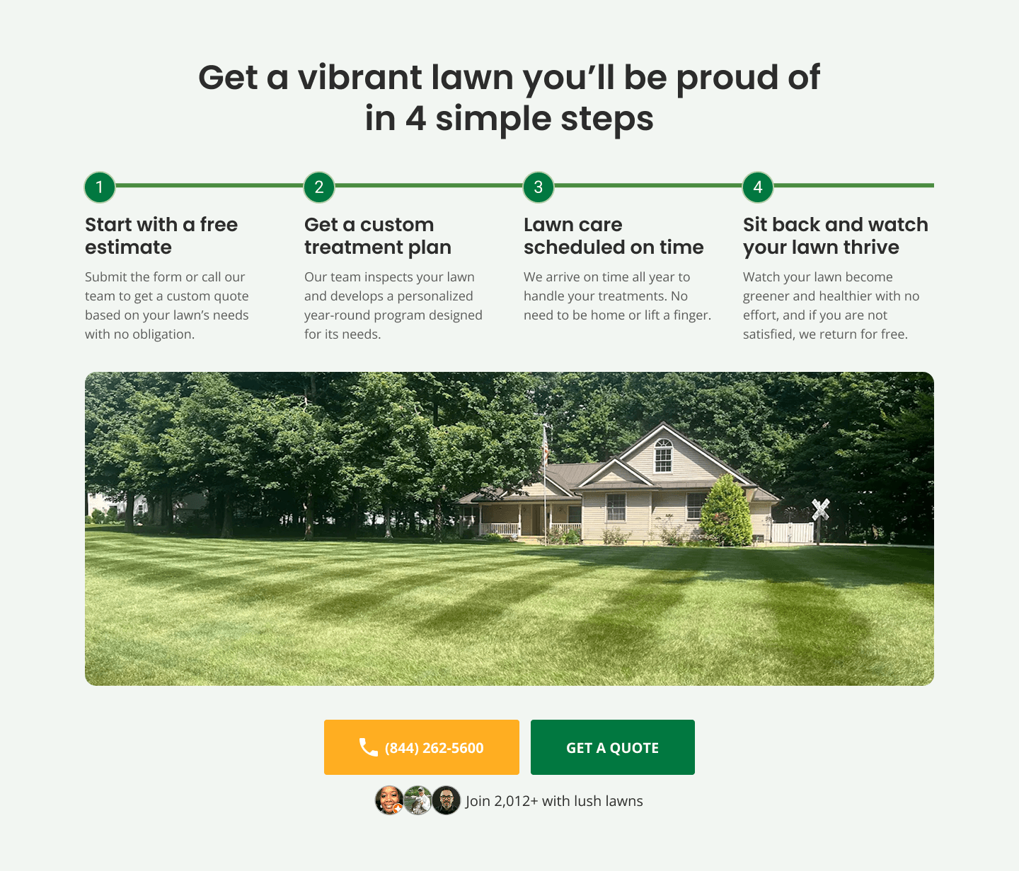
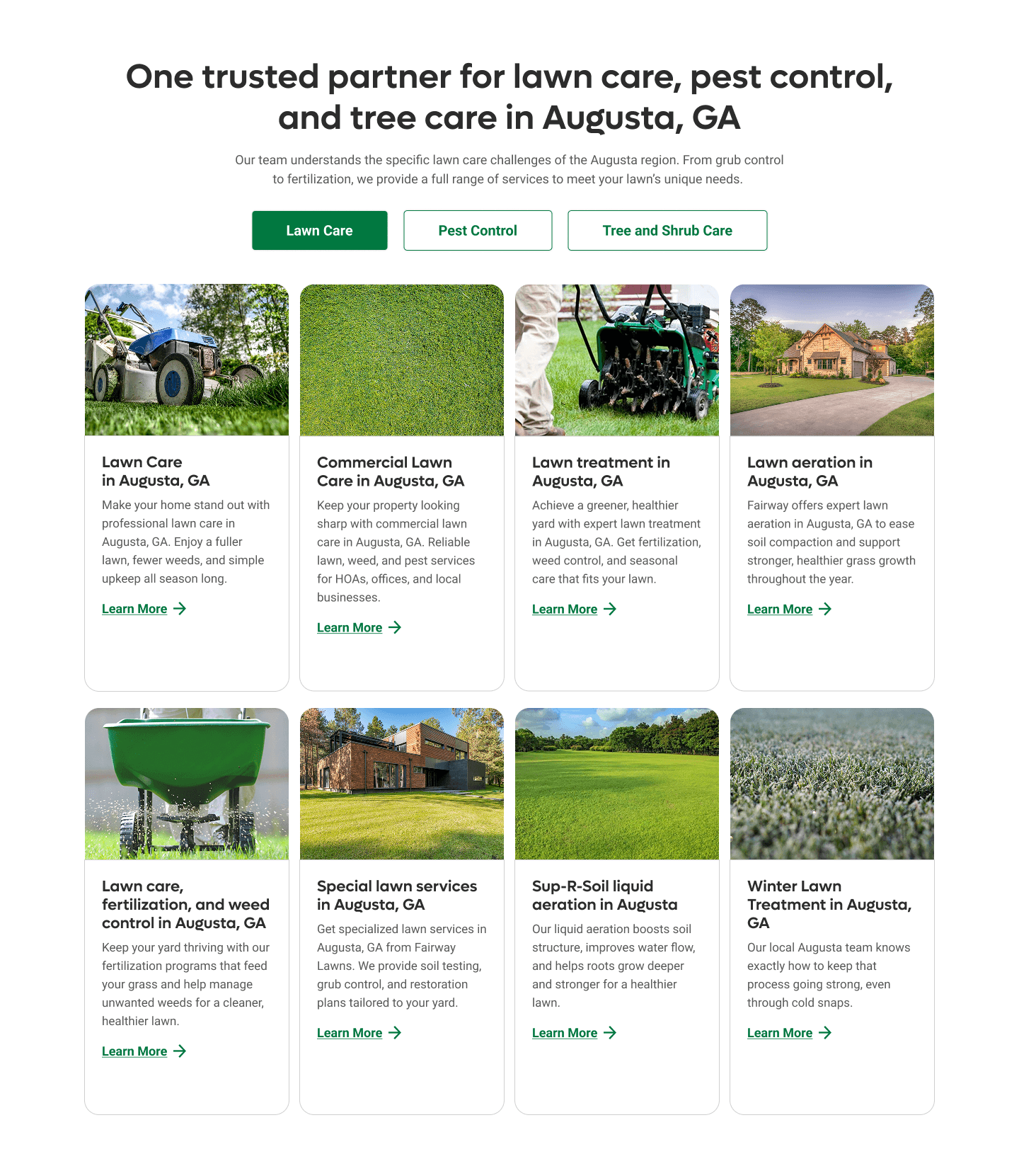
In November 2025, I partnered with Kapp's Lawns to rebuild how their lawn care brand speaks online. Kapp's is not a new player. They had strong real-world credibility but a digital presence that undersold their expertise. Their service is personal, reliable, and proud of local expertise, yet their website didn't communicate any of that. My role was to rebuild the brand narrative and CRO foundation through copy-led design.
I was brought in to:
Run a competitive analysis of lawn care and related home service brands.
Design new section/content structures that follow strong CRO principles.
Build a brand voice that actually reaches the right homeowners in each market.
Write the copy for the homepage and six location pages so that Kapp's feels distinct and credible in a sea of "we care about your lawn" competitors
The visual redesign wasn't for the sake of aesthetics, because it was clear from the beginning that their problem lay in the way they communicate their services and values. The layouts for the redesign weren't our priority, because they already existed or were broadly defined with my competitive analysis. My real job was to make the words carry half the weight. I had to direct attention to the reasons someone would choose Kapp's over the ten or twenty other lawn care companies they pass on the way home.
To stand out, Kapp's needed messaging that would articulate real value, eliminate skepticism, and make choosing them against the sea of other lawn care companies feel inevitable. My work combined brand positioning, research, competitive analysis, narrative structure, CRO framing, and full copy development across all pages.
When Kapp's came to us, they already had the important part done in real life. They had happy customers. They had staff who knew local soil, pests, and seasonal patterns inside out. The problem was that none of that lived convincingly on their website.
From the conversion and messaging perspective, I identified four core issues:
💜 Brand gap
The existing language and structure did not reflect the reliability and local expertise Kapp's had offline. The site did not feel like the company that people recommended to their neighbors. It felt generic.
💎 CRO gap
The copy described services, but it did not sell outcomes. It listed what they did, but not why it mattered or what life looks like after hiring them. There was no clear hierarchy of messages that would guide a first time visitor from mild curiosity to a strong urge to get a quote.
👥 Audience alignment gap
The site did not speak directly to the real homeowner they wanted most. The typical Kapp's customer is a busy homeowner who cares about curb appeal, wants a thick green lawn without spending weekends fighting weeds, and cares more for reliability than what was just "cheap." The language on the page did not mirror those needs or emotions.
📍 Differentiation gap across locations
Kapp's serves multiple markets. Cleveland, Fort Wayne, Indianapolis, Eastern Pittsburgh, Western Pittsburgh, and St Louis all have different climates, neighborhoods, and homeowner expectations. The original content approach risked making every location page feel like a light copy of the homepage. That approach risks diluting homeowner trust, making Kapp's look like a cookie cutter franchise.
My challenge was to design a messaging system that feels trustworthy from the first scroll, positions Kapp's as the expert in every region, and persuades homeowners to choose them even when cheaper or more familiar options exist.
The core constraint was that copy had to do a lot of the heavy lifting. Designs can signal trust and simplicity, but only the words can take a homeowner from "I just need someone to fix my lawn" to "this is the company I want to work with."
Before writing a single line or revamping the overall site and branding, I had to treat it like a high stakes CRO redesign. I needed to understand the psychology of lawn care buyers, the realities of each market, and the patterns that were already working in the industry.
Audience research
I started by mapping the likely Kapp's customer. Not just as a demographic, but as a person with a schedule and a set of frustrations. Kapp's services six regions. Homeowners in these cities want the same outcome: a lawn they're proud of - but for different reasons and with different frustrations. Cleveland deals with volatility, Fort Wayne with demanding seasons, Indianapolis with wasted money on generic treatments, Pittsburgh with steep climate swings, and St. Louis with pest-heavy summers.
Understanding these environmental nuances gave me the foundation to write pages that feel genuinely local instead of lightly edited duplicates. But a few things were the same across the board:
Homeowners who want the best looking lawn on the block without sacrificing weekends.
Homeowners who have exhausted generic treatments.
Homeowners who care about curb appeal, and home value, but do not want to become hobby lawn experts.
Homeowners who respond more to reliability, and proof than to empty promises or overselling services.
Competitive Analysis
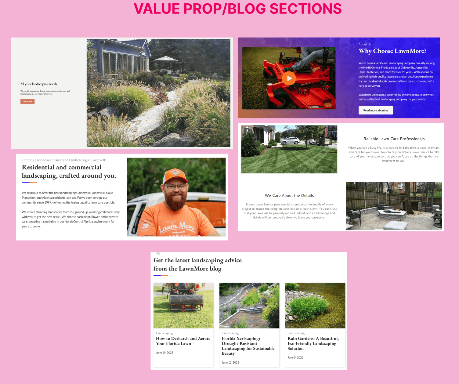
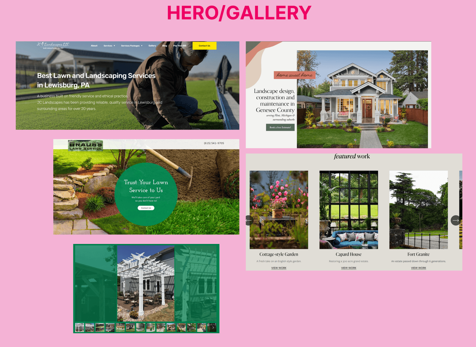
Knowing who I'm now trying to sell Kapp's to, I ran a full competitive teardown across lawn care brands. I analyzed hero structures, proof patterns, service explanations, CTA placements, and trust signals, capturing what actually converts and what falls flat.
I took note of what felt convincing, what felt like empty marketing, and where the user journey dropped off. Many sites looked nice but failed to move a visitor logically toward contacting the company. This helped me define what not to do: empty slogans, vague promises, and copy heavy pages with no clear core message.
Reference Bank
I built a reference library of screenshots and annotated patterns to understand how visual cues, tone, and hierarchy influence trust in such a competitive market. This helped me identify exactly where most lawn care brands go generic and where Kapp's could stand out with sharper messaging, cleaner structure, and a more credible voice.
I looked for:
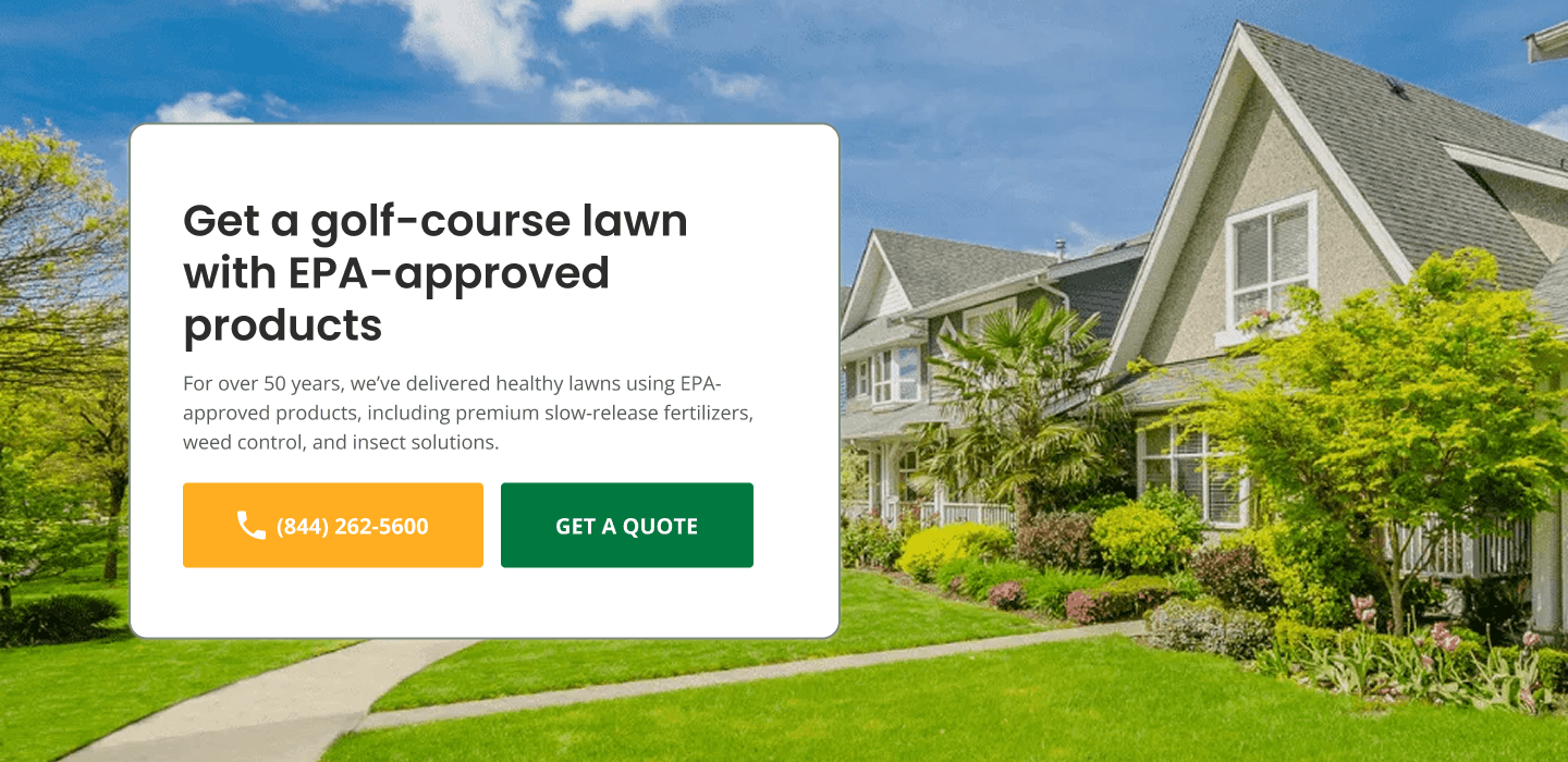
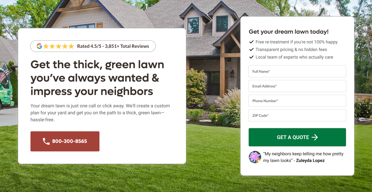
Simple, bold heroes with one clear promise
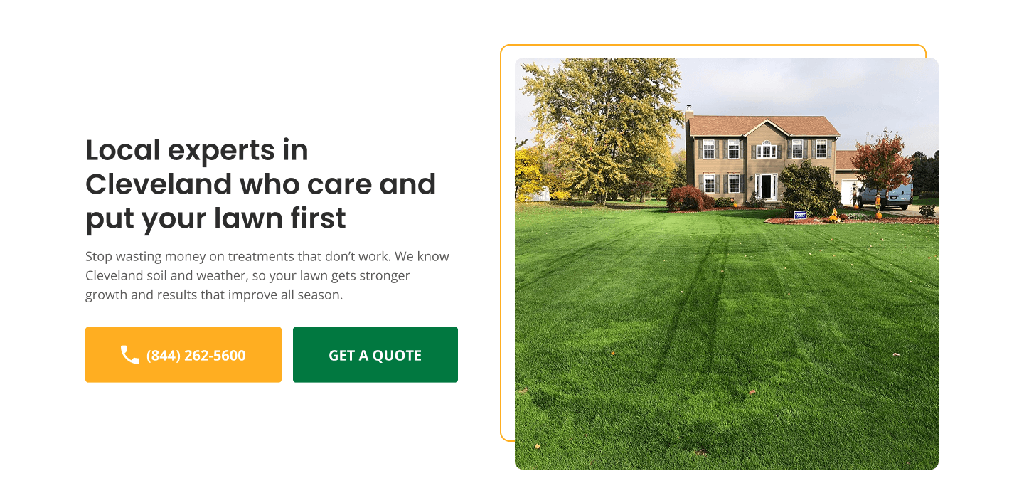
Visual proof of green lawns and real properties
Sections that anchor on "why us" with specific reasons
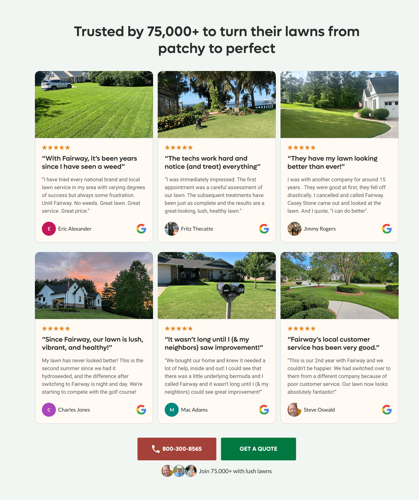
Customer review snippets placed near calls to action
I used these references later to influence pacing, section order, and the weight of proof on each page.
Value Documentation
Finally, I documented what makes Kapp's itself, not just any lawn care provider.
Full-service care across fertilization, weed control, pest control, aeration, seeding, and tree and shrub care
An emphasis on results that are visible from the curb and felt in daily life
Simplicity of one team handling the yard so the homeowner can focus on everything else
These became the value pillars behind every page. By grounding the work in real user motivations, regional insight, and conversion-led references, I ensured that the homepage and all six location pages had their own identity while still expressing one cohesive, trustworthy brand.
Being centred around the copy, I gave myself the challenge to write with a designer's eye. I had to understand how every line would sit inside the visual system, how images would reinforce meaning, and how testimonials and section pacing would build trust without overwhelming the user. The words needed to feel confident, and lightly aspirational (something a homeowner can read in one breath while immediately picturing their lawn looking better).
I shaped the voice and design around eliminating jargon, avoiding technical overwhelm, and giving each page a rhythm that mirrors the actual Kapp's experience. The site needed to feel like the company: steady, reliable, friendly, and excellent without boasting. Having a lot of breathing room between sections that were too text or promise heavy gave visual breaks, where users were then confronted with testimonials and real-lawn makeovers from Kapp's.
I wrote with the assumption that every photo and review had to carry half the persuasive weight. My copy pointed users toward what they should notice, while visuals would validate the words. Visuals, testimonials, and copy became the brands tone. This created its own visual direction where homeowners would feel safe choosing them.
Writing the homepage and six unique location pages required an extremely intentional balancing act. The challenge was to build a voice that is warm, local, and grounded in real-life outcomes - and then stretch that voice across pages without repeating myself or diluting the brand.
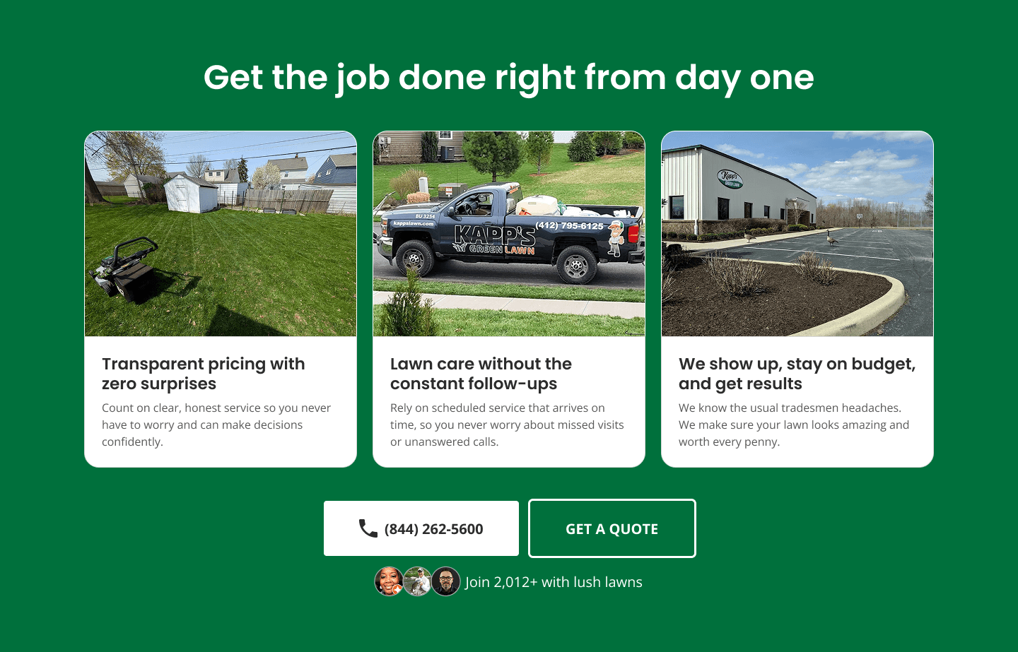
The homepage became the central pattern: a simple emotional hook, a concise explanation of services, early proof, and friction-free CTAs. I rewrote every headline to speak directly to the homeowner's emotional landscape, and every supporting line to ease skepticism. Outcomes replaced technical jargon. I positioned Kapp's as the team that makes homeowners proud of where they live and relieved they don't have to manage yard work themselves.
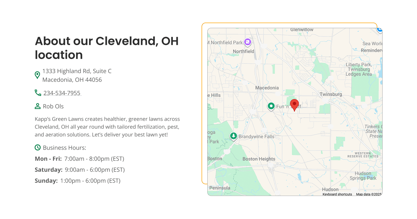
Then came the location pages. Each city needed its own emotional hook, and its own story about why Kapp's is the right choice there. I found neighbourhood characteristics to make the copy feel rooted in the place rather than pulled from a template. Cleveland's page feels like someone who has lived through its harsh seasons. Fort Wayne's page feels climate-aware. Indianapolis feels tired of wasting money and ready for real results. Pittsburgh's two pages speak to two different personalities of the city. St. Louis centers on local pest challenges and home pride.
Across all pages, I wrote around images and testimonials so each page feels alive and validated. And throughout, I treated copy as the tool that turns a website from "information" into "persuasion."
What Was Hard
The hardest part of this project was not finding words. It was deciding which words deserve to be on the page. If I simply changed the city names, I would have saved time, but I would have also removed any sense of real local connection.
Lawn care is a category full of repetition. Every site promises green lawns, weed control, and local pros. Every company claims to care. In that environment, it is extremely easy to slide into generic phrasing that looks fine but does nothing to move a real homeowner tired of companies overselling and underdelivering.
The difficulty lived in three places:
Writing unique location pages without losing brand cohesion
Cleveland and St Louis cannot sound identical. Fort Wayne and Indianapolis cannot share the same exact story. I had to find six distinct angles that are still true to Kapp's and still work within a strong CRO structure.
Balancing design and copy weight
The designs carry half the weight, creating rhythm, hierarchy, and clarity. The copy carries the other half. It has to point the user at the right things at the right time. If I wrote too much, the pages would feel heavy. If I wrote too little, they would feel thin and unconvincing.
Crowded, low trust category
Many homeowners have had a disappointing experience with lawn care at some point. Either paid for treatments that did not work, or for services that were not consistent. That skepticism is real. The hardest part was writing in a way that feels believable, and grounded in proof.
If a line did not reduce uncertainty, clarify value, or make the next click feel easier, it had to go. This restraint is what makes the pages feel calm and confident rather than noisy.
This project reinforced a core belief: great service pages are not "designed," they're orchestrated. Copy, layout, and psychology work together as a system, and when one component is weak, the entire experience collapses. By grounding the Kapp's ecosystem in real audience insight, regional nuance, and persuasive pacing, I built a structure that reassures homeowners in a single scroll.
"Template thinking" only works when you personalize it deeply. I absolutely leaned on proven CRO patterns to structure the homepage and location pages. The difference is that each section was filled with specific, localized language and proof rather than general promises.
This project sharpened my ability to scale voice across multiple similar pages without flattening personality. Writing for six locations pushed me to pay close attention to nuance, local context, and emotional resonance while staying inside one unified brand system.


