Visual Design
Poster for CAMH

I conceptualized a poster for CAMH to display around the city. The aim was for it to resonate with those in need of help, compelling them towards reaching out for CAMH's services.
Research stage
While researching for a design that would attract newcomers to CAMH's services, I aimed to create something that symbolized not just CAMH, but more vividly, a person in need of help or a sense of emotional weight through poster illustration. My process involved collecting references and brainstorming concepts that could instantly communicate the feeling of heaviness and the urgency of seeking help, which is often postponed.
During this phase, I identified the ideal color palette comprising browns, blacks, yellow, blue, and greys, a scheme that remained consistent in the final piece. Additionally, I opted for a bold font for the text, choosing a complementary shade of yellow that stood out against the deeper tones of the rest of the piece.
Curating ideas
I navigated through a range of concepts to capture the depth of emotion in a way that reflects not just one, but multiple disorders and feelings. This approach aligns with the broad scope of CAMH, which doesn't limit itself to a single kind of illness. I knew I wanted to depict three different, interchangeable emotions: happiness, sadness, and indifference. This led to the idea of representing each emotion with a distinct symbol. The challenge was managing the overflow of ideas for representing various illnesses while trying to figure out how to seamlessly blend three contrasting emotions into one piece that flows in the right way.
My final poster design
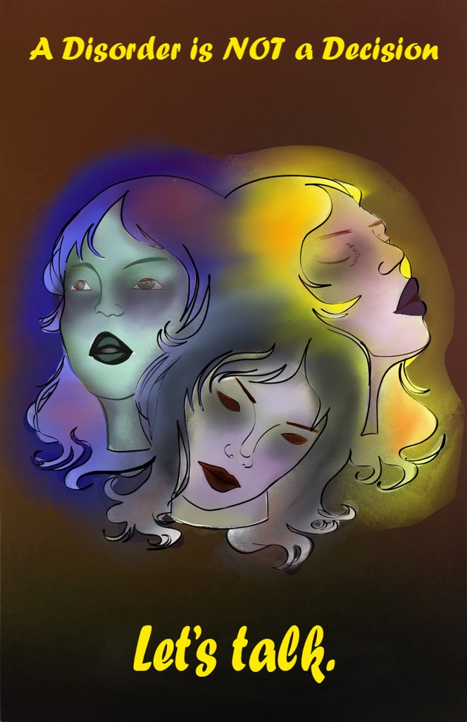
After much deliberation about the final concept for my poster, I settled on depicting three heads of the same person, each embodying a different emotion: happiness, sadness, and indifference. These emotions are represented through the colors yellow, blue, and dark gray, respectively. Central to this piece is my own slogan, "A disorder is NOT a decision", challenging the common misconception that people can easily control their emotions. In its final form, the poster features just the three heads, the impactful slogan, and their respective colors. These elements together create the intense atmosphere I envisioned, with the colors of the heads subtly blending into the background and into each other.
Adding in text
During the final stages of creating my piece, I was exploring the significance of text in the poster, especially gauging how much was too much. I aimed for the artwork to convey multiple emotions, and toyed with the idea of adding a list of commonly misdiagnosed disorders in a dark gray shade, subtly blending with the background. However, this addition started making the piece feel 'busy', distracting from the three central figures and shifting the visual weight to the bottom half. Eventually, I decided against including the text, keeping only the slogan and the three heads. I found that this simpler approach more effectively communicated the message, allowing viewers to engage with and feel it, rather than having to read to understand.
The three versions of my work
My poster idea for CAMH to be displayed around the city and have those in need of help and their services to feel drawn into reaching out for help.
Research stage
Going through the research stage of coming up with ideas to best draw in newcomers to the services of CAMH, I wanted to create a design that less represents CAMH, and more instantly is recognizable as a person in need of help, or the feeling of heaviness through a poster illustration. I started gathering references and coming up with ideas that could immediately be viewed and understood as heaviness and give off the need to get help that people keep putting off on getting.I found the right colour palette during this stage, of browns, blacks, yellow, blue, and greys. All of these shades are consistent through the final piece, and I also had chosen a very bold font for the text, to be displayed in a complementing shade of yellow in contrast to the deep hues through the rest of the piece.
Curating ideas
The ideas I had come up with for this poster, were a range of many different takes on what displays depth of emotion in the best ways, in a way that does not show just one disorder, but can be read into looking like the face of multiple different disorders and feelings at once, since the work CAMH does, does not cover just one kind of illness. When coming up with the ideas, I knew that I wanted to display three different interchangeable emotions, of happiness, sadness, and indifference, which gave me the want to show three different symbols to represent each of those three emotions. This became a hard constraint for me since I had too many ideas for what could represent what kind of illness, but very little idea on where to begin to display three opposite emotions into one piece that flows in the right way.
My final poster design
After a lot of back and forth between what idea I should settle with and what my posters final version needs to include, I decided that the final idea needed to be of three heads of the same person, each showing the three emotions I wanted to display, being happiness, sadness, and indifference. Each of these emotions being represented by the colour yellow, blue, and dark gray. Within this piece, I wanted to create my own slogan "A disorder is NOT a decision", to combat the often occurring misconception that people can just snap out of their feelings when they want to.This piece in the final version was to use just the three heads, the slogan, and its colours, to give off the heavy feeling I wanted to show with the poster, as well as the colours of the three heads seeping out into the background and into each other.
Adding in text
During the final stages of my piece, I was playing around with the significance of text in the poster, and how much text was too much. I wanted the piece to represent and showcase multiple emotions at once, and an idea I had was to write down in the bottom a curated list of the most common affecting and misdiagnosed disorders in a shade of dark gray so it blends in in a way with the background.The problem with all this writing was that it began to take away from the three heads, and created a 'busy' feeling where it was not allowing the eyes to focus on the top of the piece as much of the weight was being carried into the bottom half due to all the text. In the end I left the text out and only kept the slogan I made, along with the three heads. I found the simplicity did a much better job at conveying the message and having the viewer feel the message rather than have to actually read it to understand.